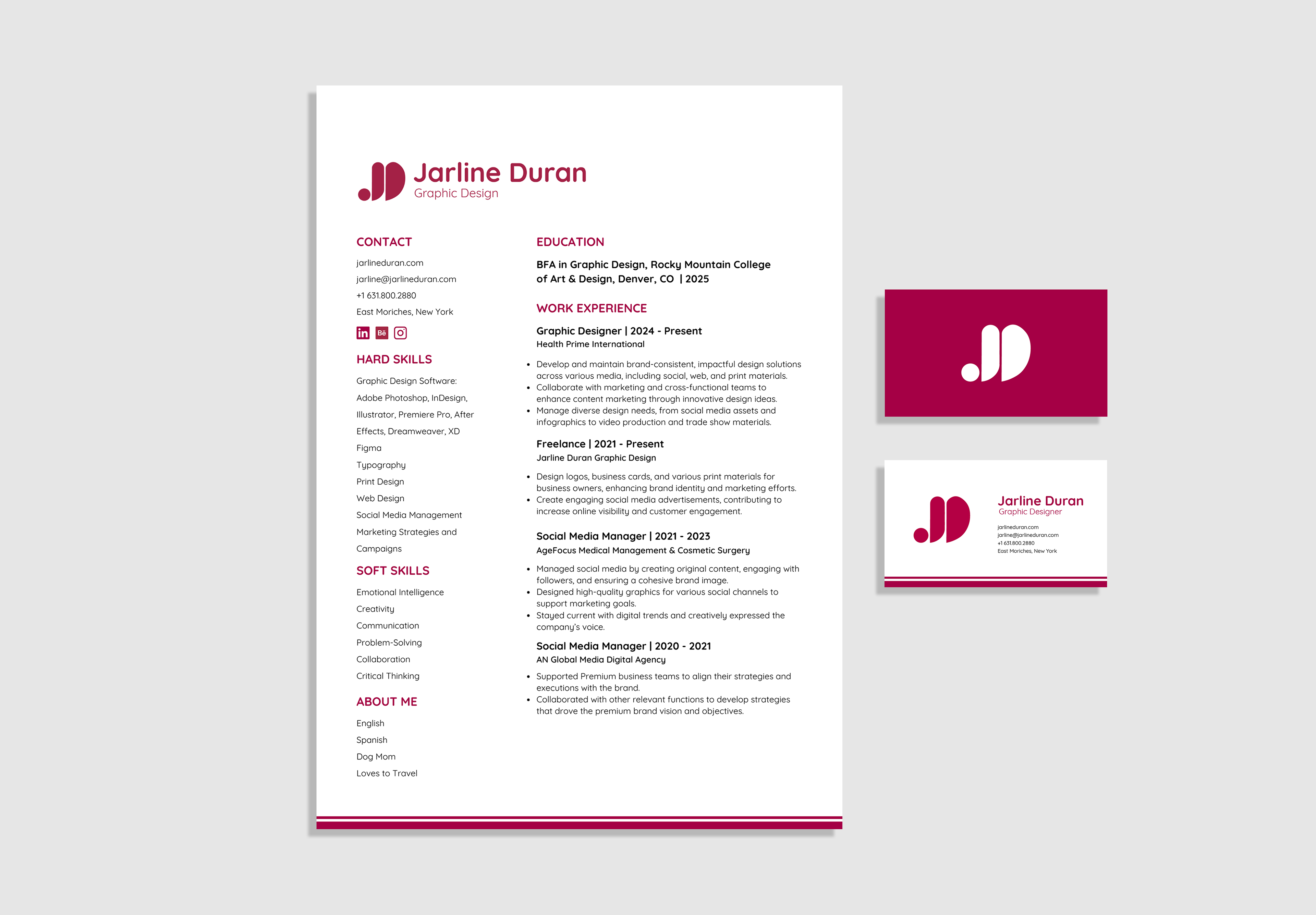
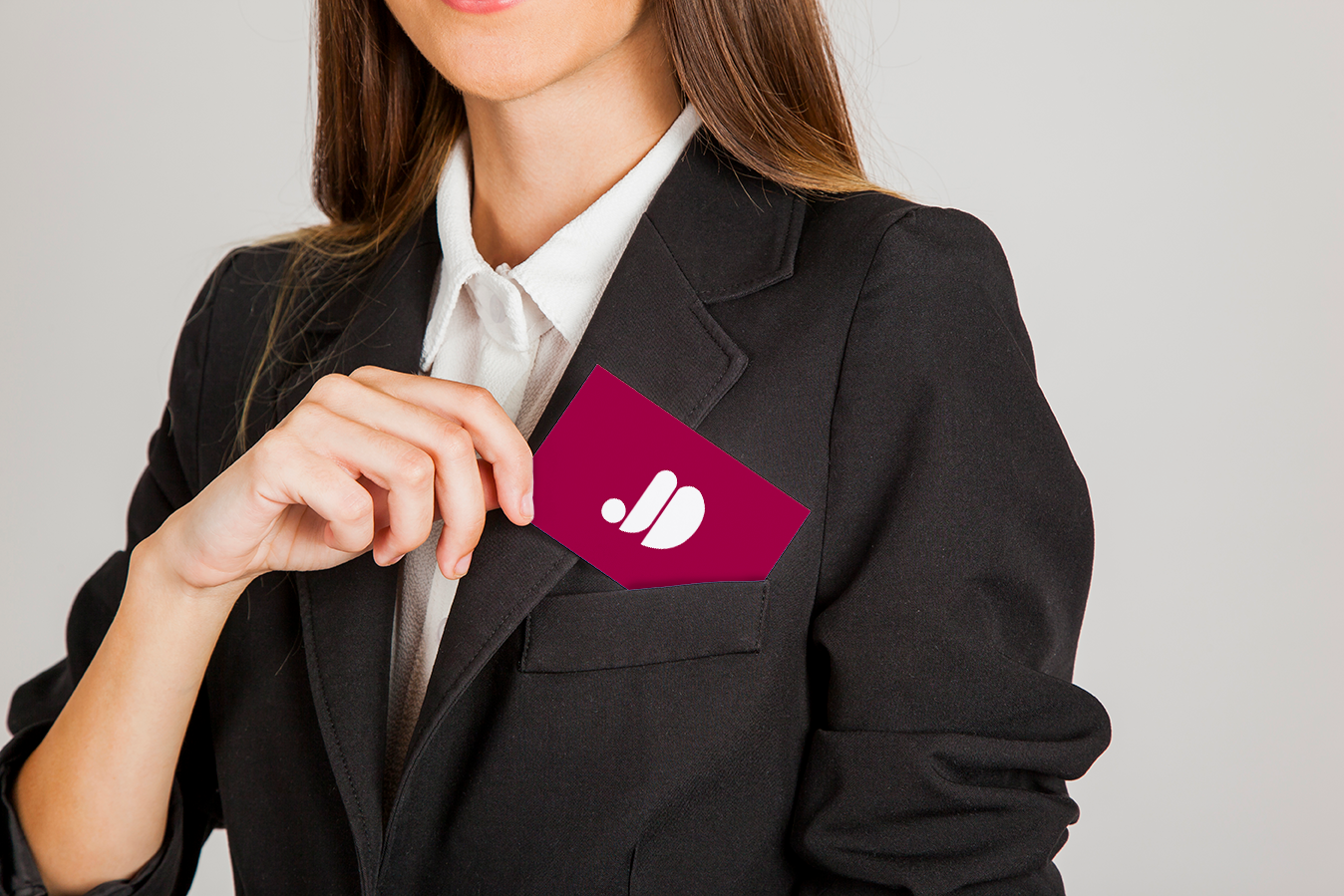
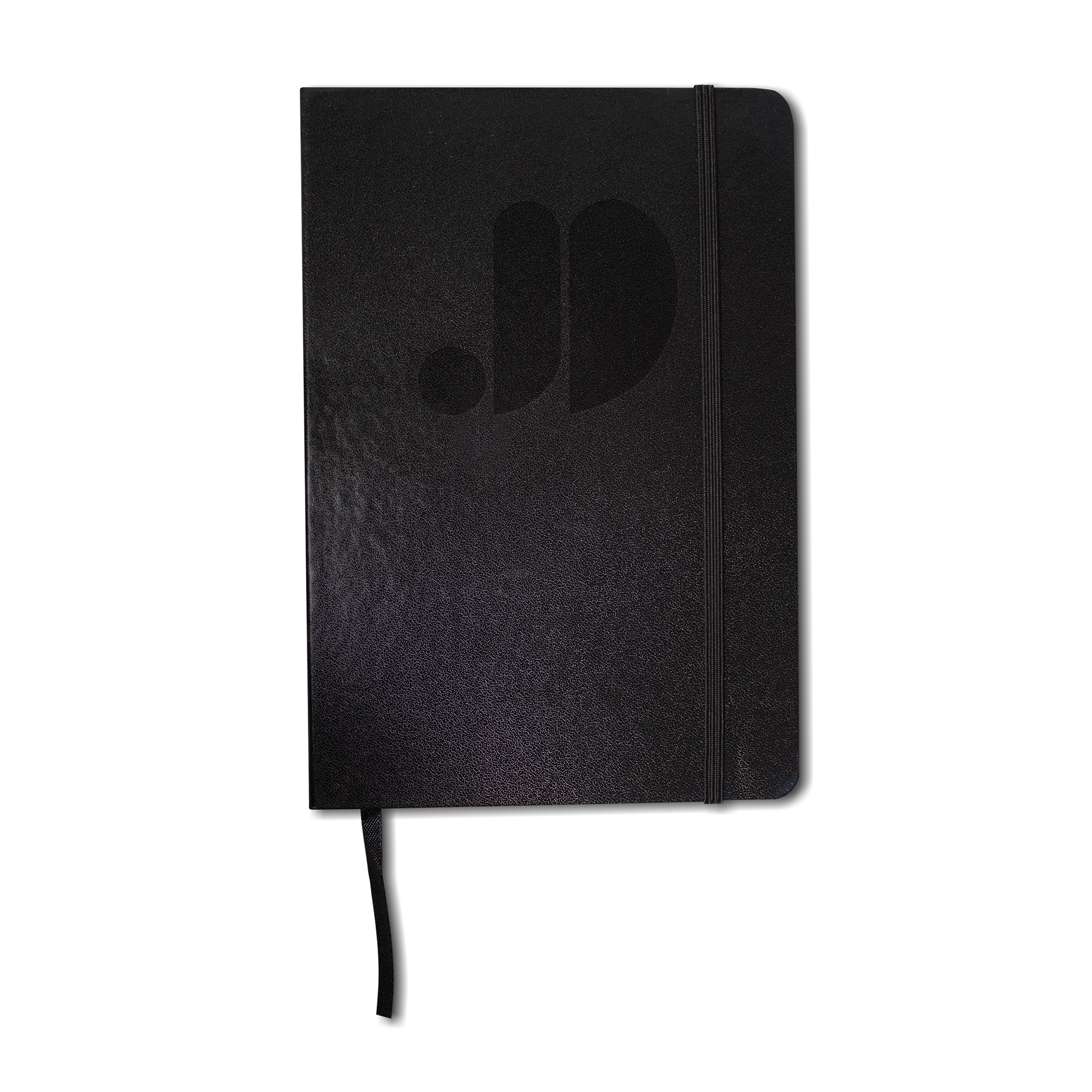
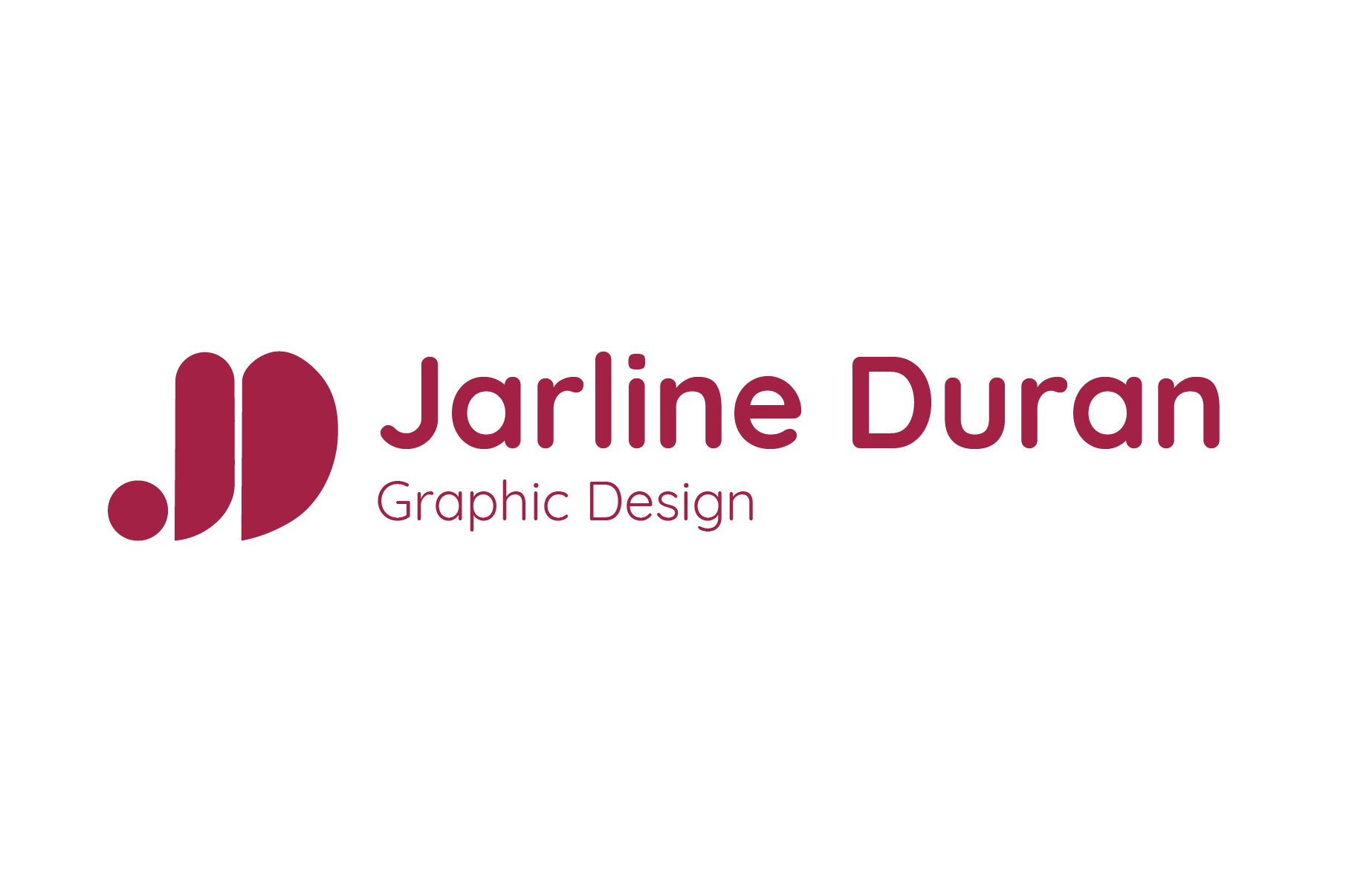
Jarline Duran Graphic Design is a fun, creative, professional, and elegant brand that represents my passion for visual storytelling. It blends bold creativity with strategic design to create impactful and memorable work. Through color, typography, and layout, I craft designs that are both visually striking and thoughtfully executed.
Process Work
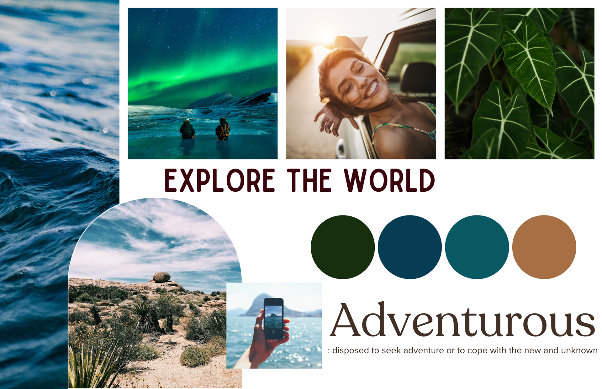
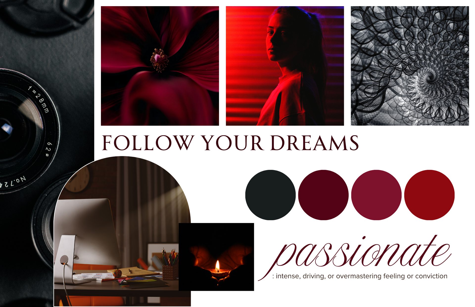
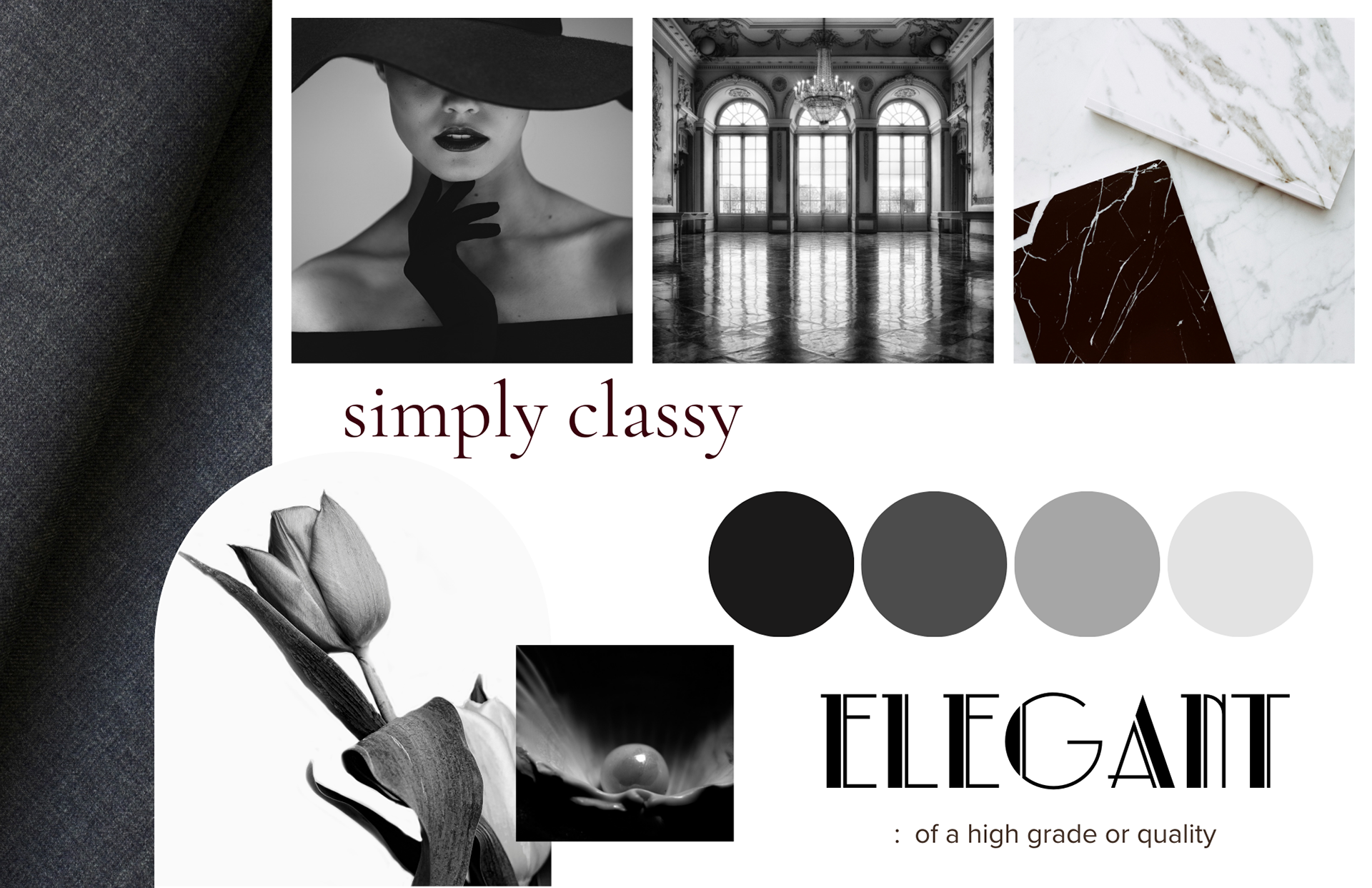
Inspiration - Mood Boards


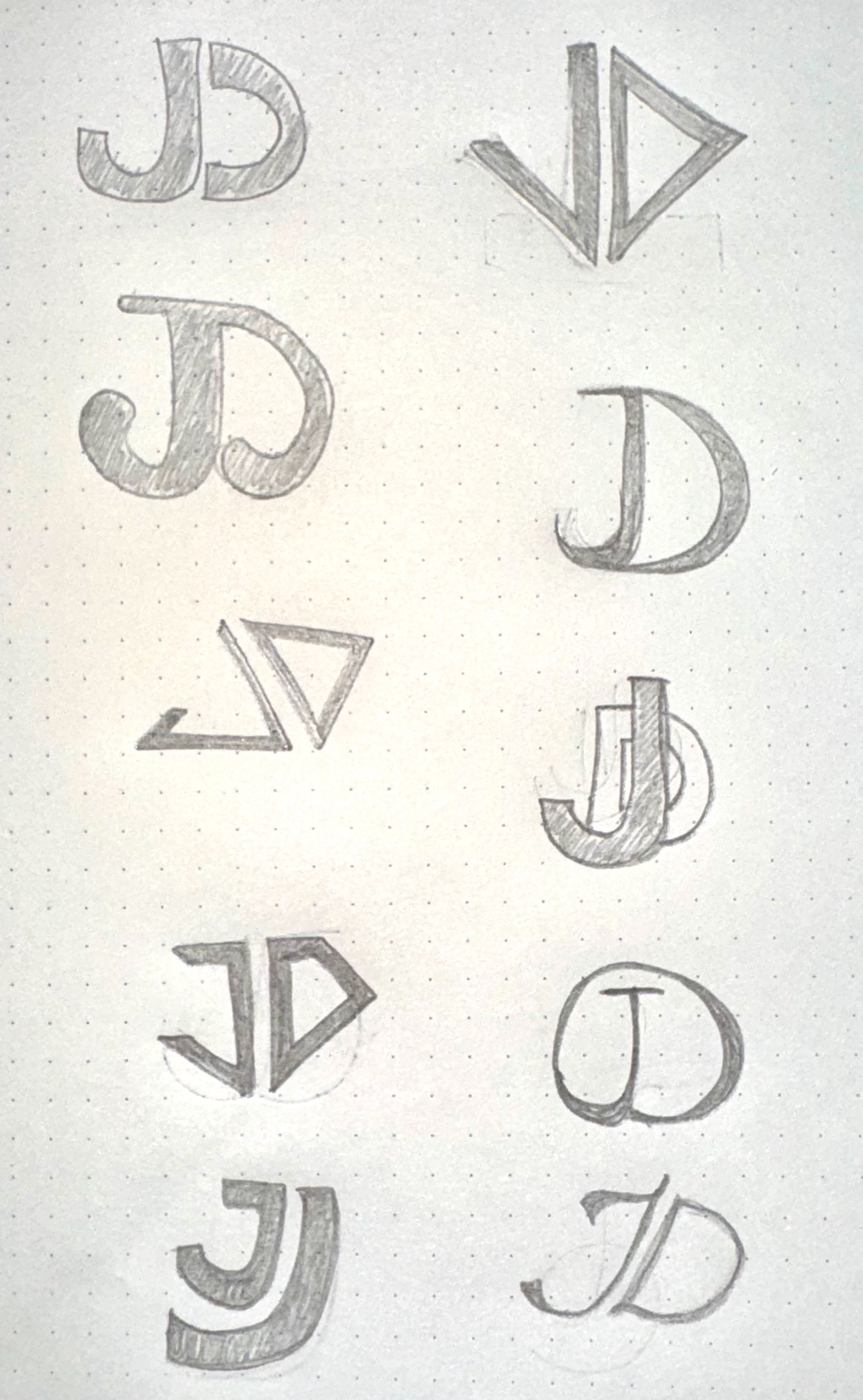
Sketches

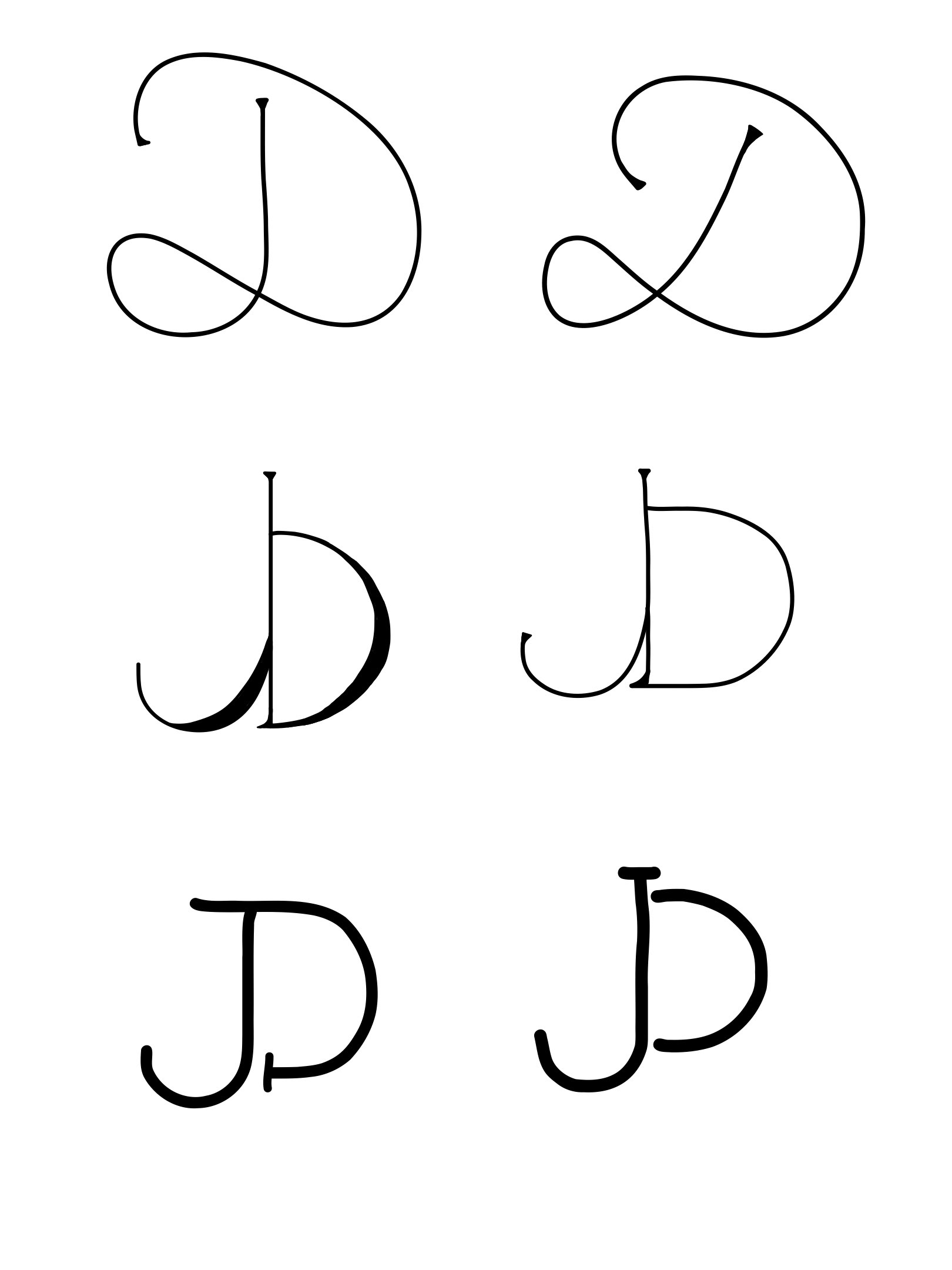
Digital Drafts
Typography
Color Palette
Quicksand - Bold
Quicksand - Regular
Final Logo
I ultimately decided on the logo that incorporates shapes to form two letters, with the letter "D" representing half a heart. I chose this design because it feels meaningful and visually distinctive. The color selection was intentional as well—it’s a shade I frequently use in my computer setup and equipment. It closely resembles a bold red that makes a strong statement and immediately captures attention.
Favicon
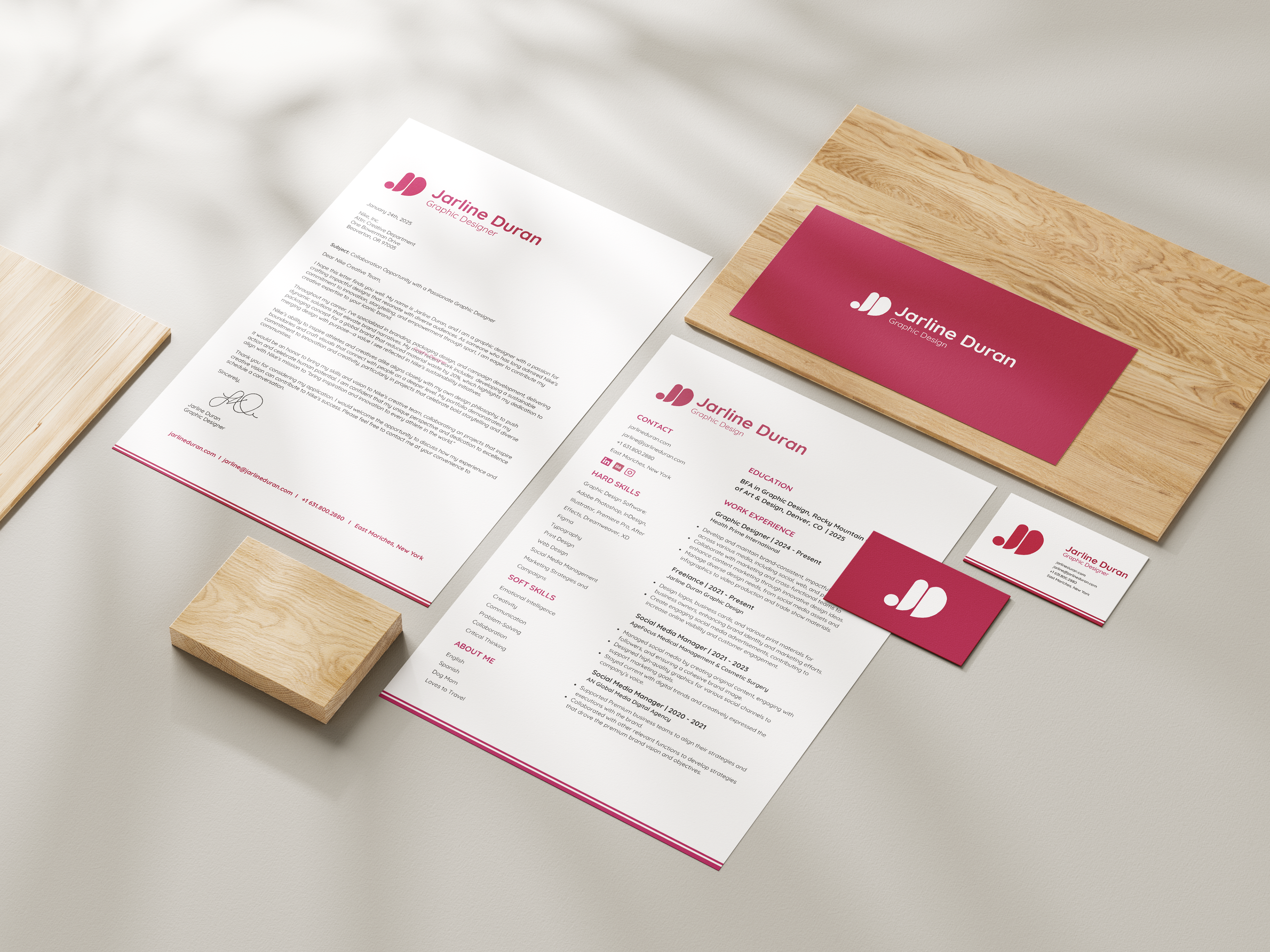
Jarline Duran Graphic Design extends its identity through carefully crafted collateral, including a resume, letterhead, envelope, and business cards. Each piece reflects the brand’s fun, creative, professional, and elegant style while maintaining a cohesive and polished look. Thoughtful typography, refined layouts, and bold yet sophisticated color choices ensure that every element makes a lasting impression.
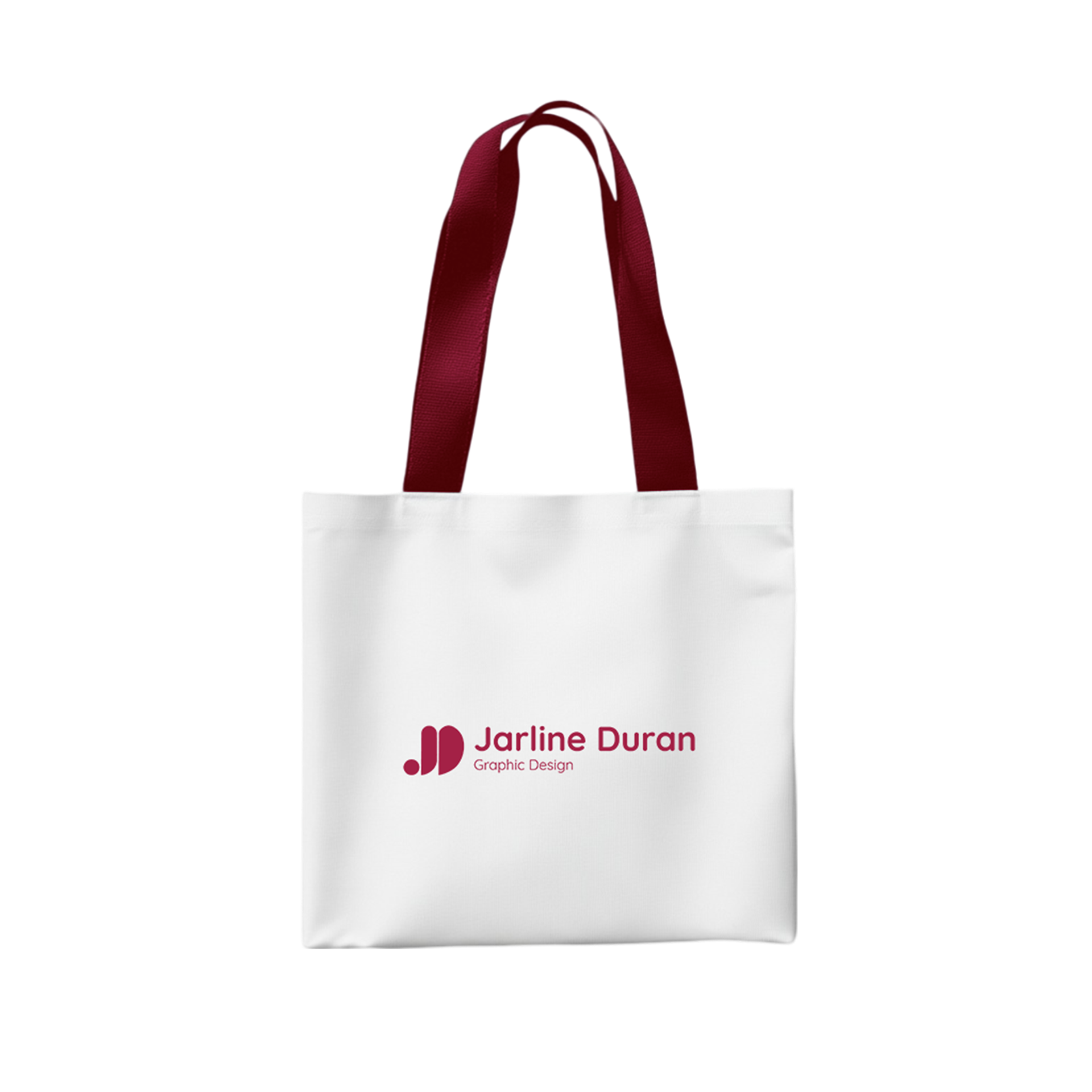
Environmental Content
